UX Case study by Adi Akkapeddi
https://www.samsung.com/us/
About
A South Korean multinational electronics corporation headquartered in the Yeongtong District of Suwon that produces Smartphones, TVs, Audio equipment, Appliances, Tablets and computing.
Problem Statement
A lot of Samsung fans want a delightful shopping experience when shopping for Samsung's new and existing Products including Smartphones, Tablets, Televisions, Fridges, etc on the Samsung Website and/or Mobile App.
We will know this to be true when Samsung provides a potential platform to do so.
Goal
To provide a digital solution from Samsung that brings all Users a feel-good experience while using the application. I redesigned the website and Mobile App that allows quick and easy purchasing with fewer click actions.
Tools
Figma, Figjam, Adobe XD, & Zoom.
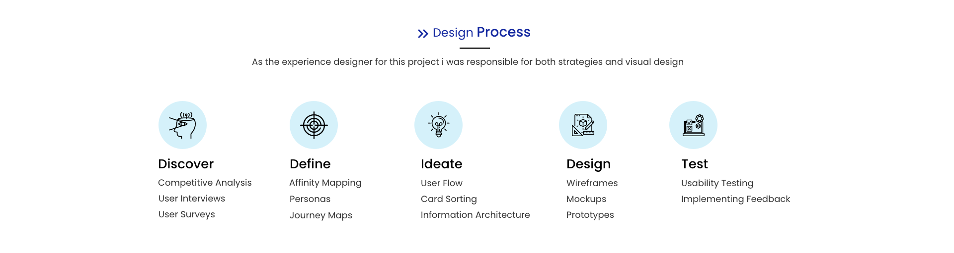
1. Discover
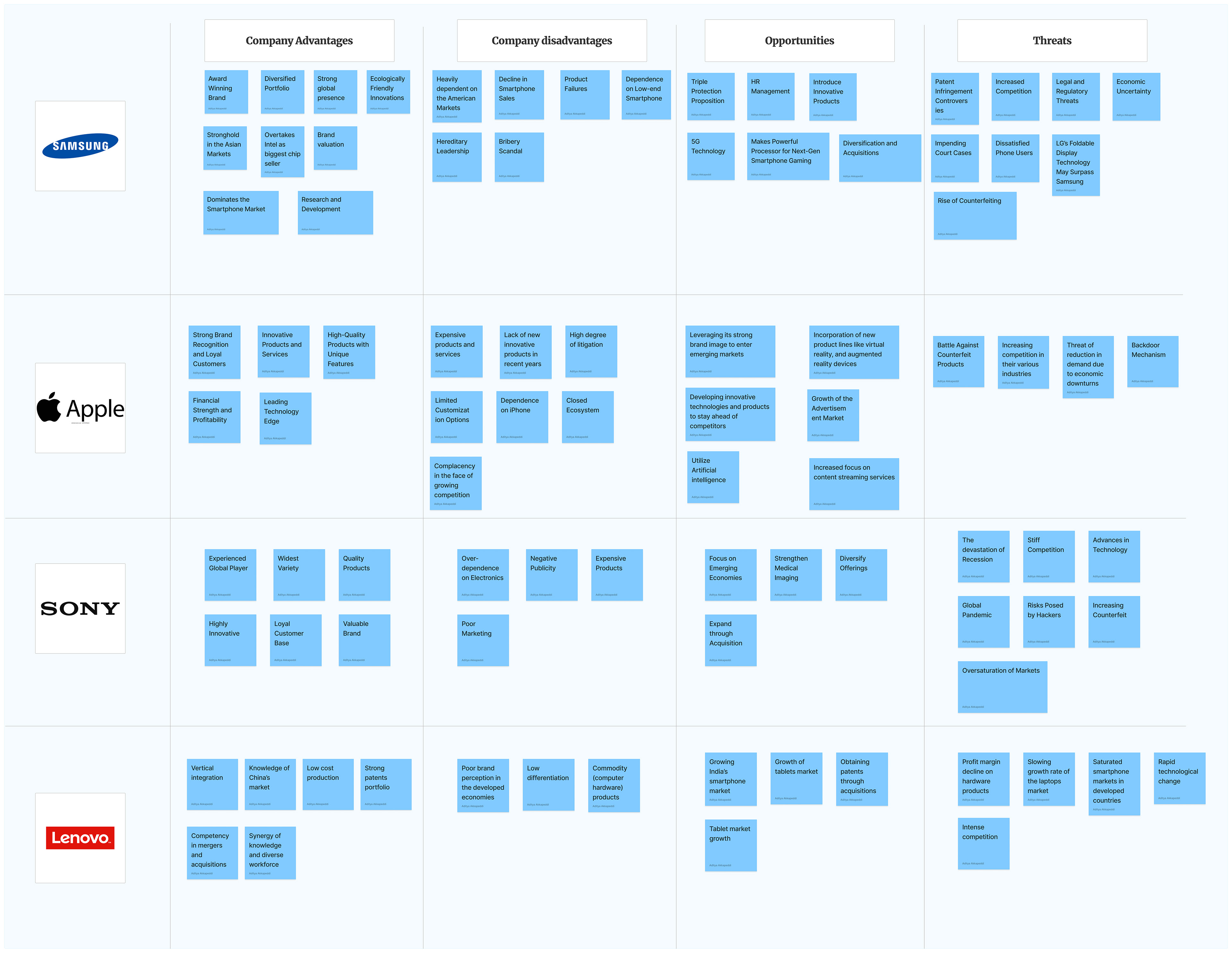
Competitive Analysis (SWOT)
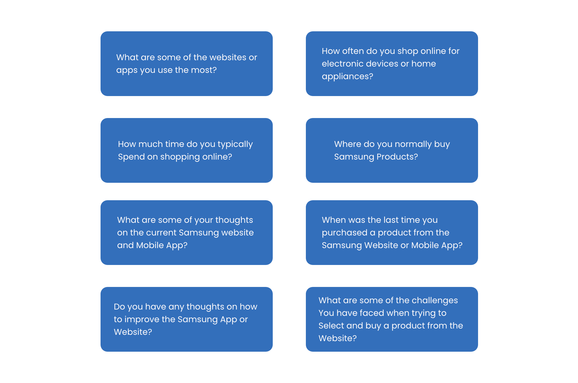
User Interviews
Participant count: 4
Duration: 30 Minutes
Questions
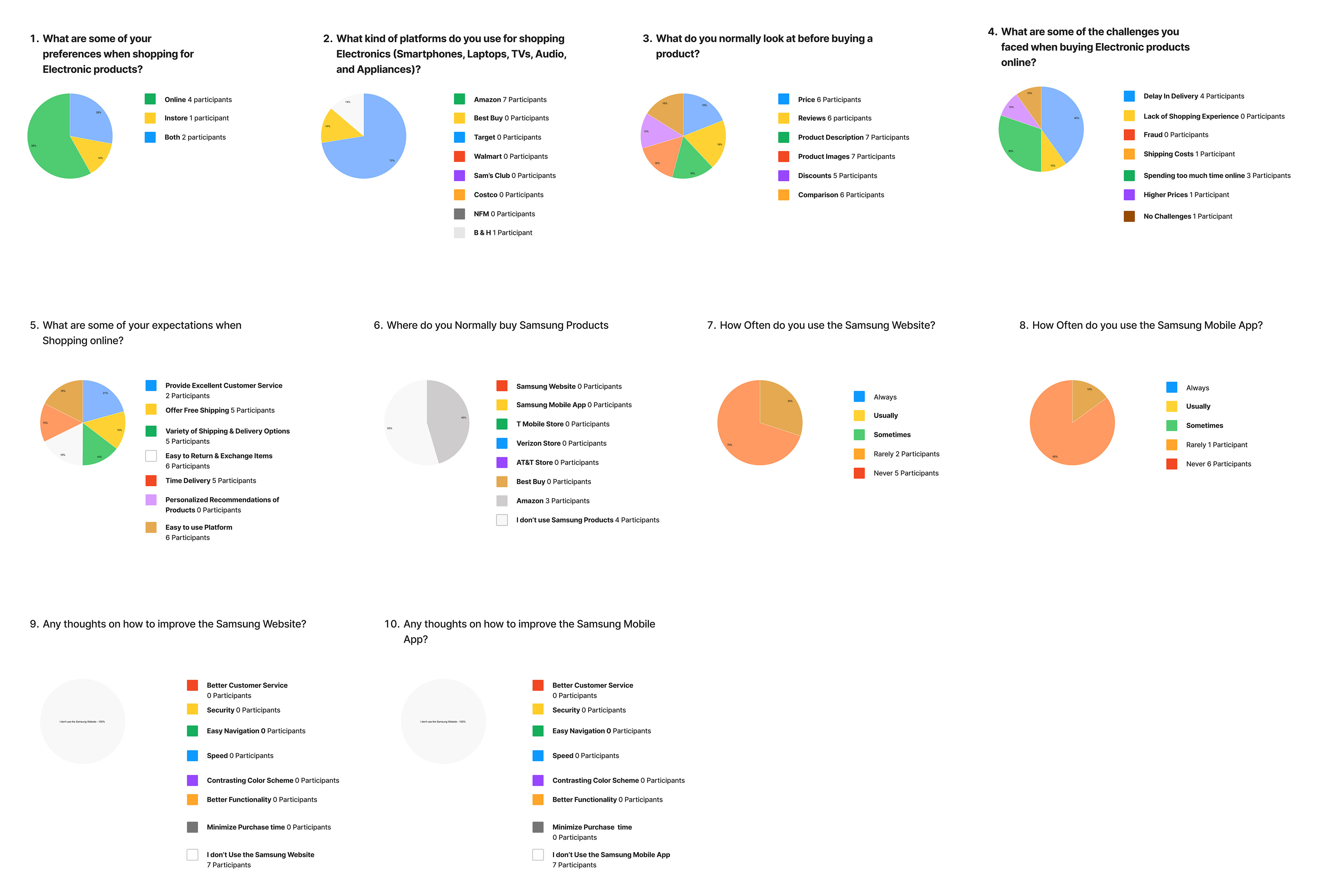
User Surveys
Participant count: 7
2. Define
Affinity Mapping
(Based on User Research Insights)

User Persona

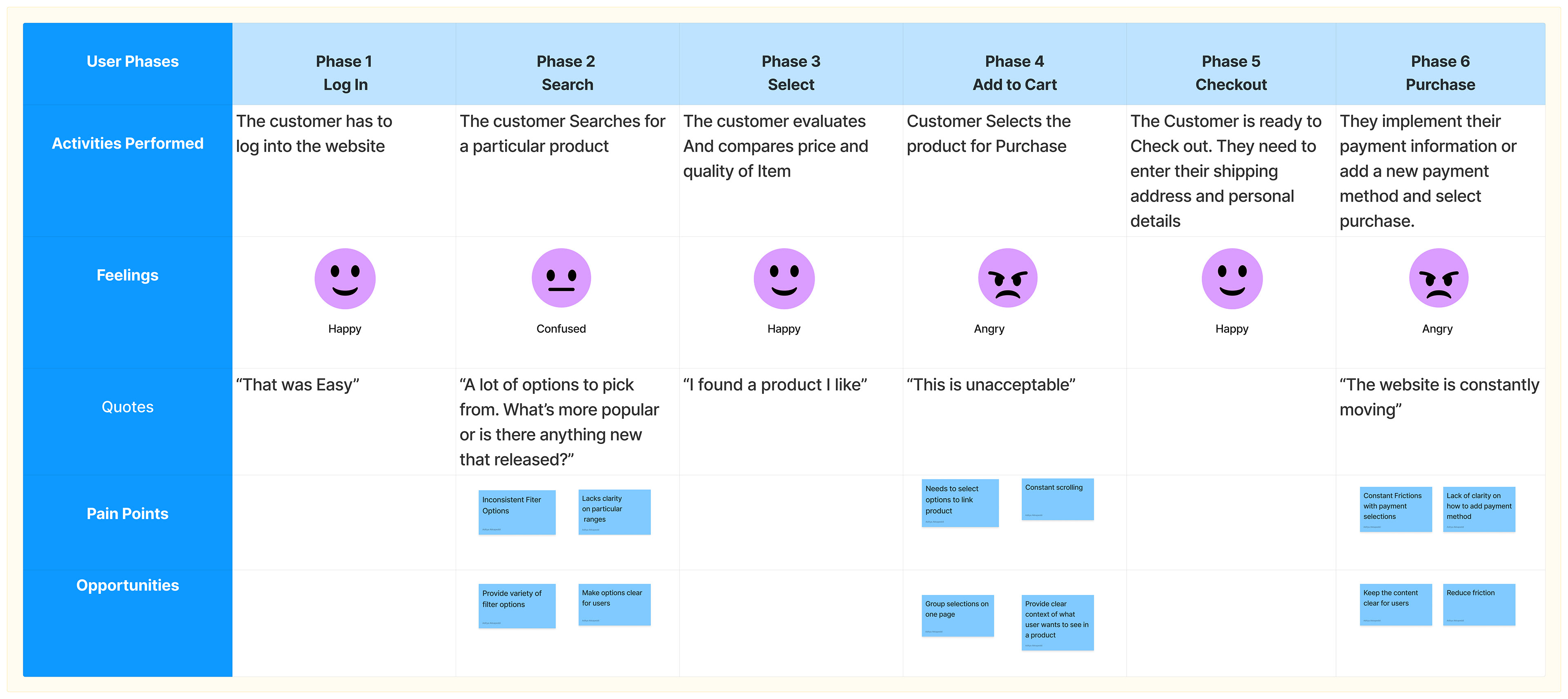
User Journey Maps
Website
Mobile App

3. Ideate
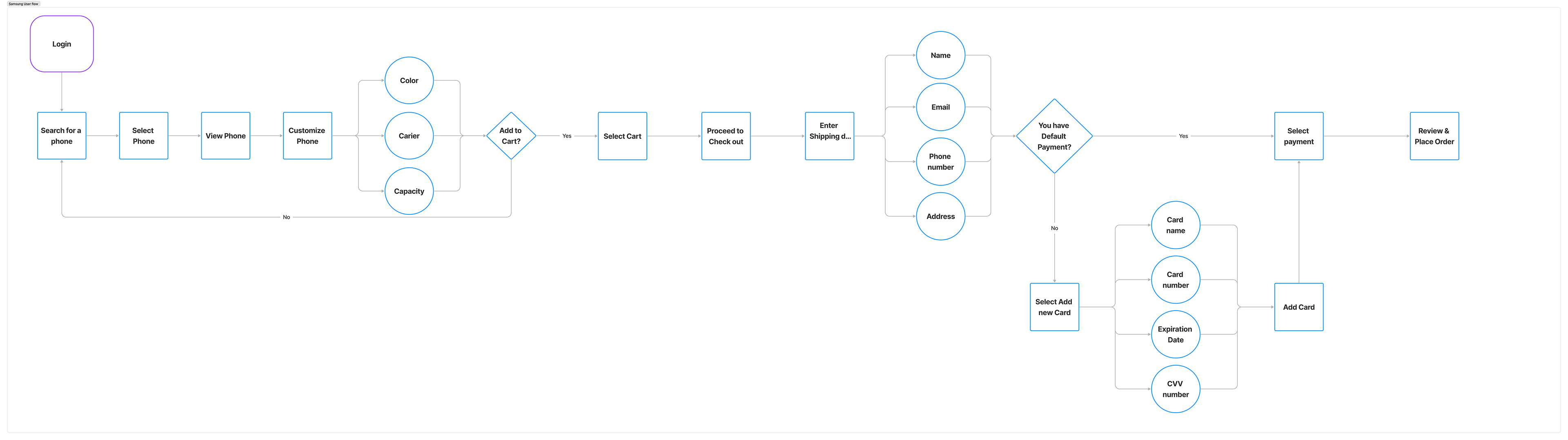
User Flows
This is a Basic User flow for Users experiencing the whole Shopping Experience
Card Sorting
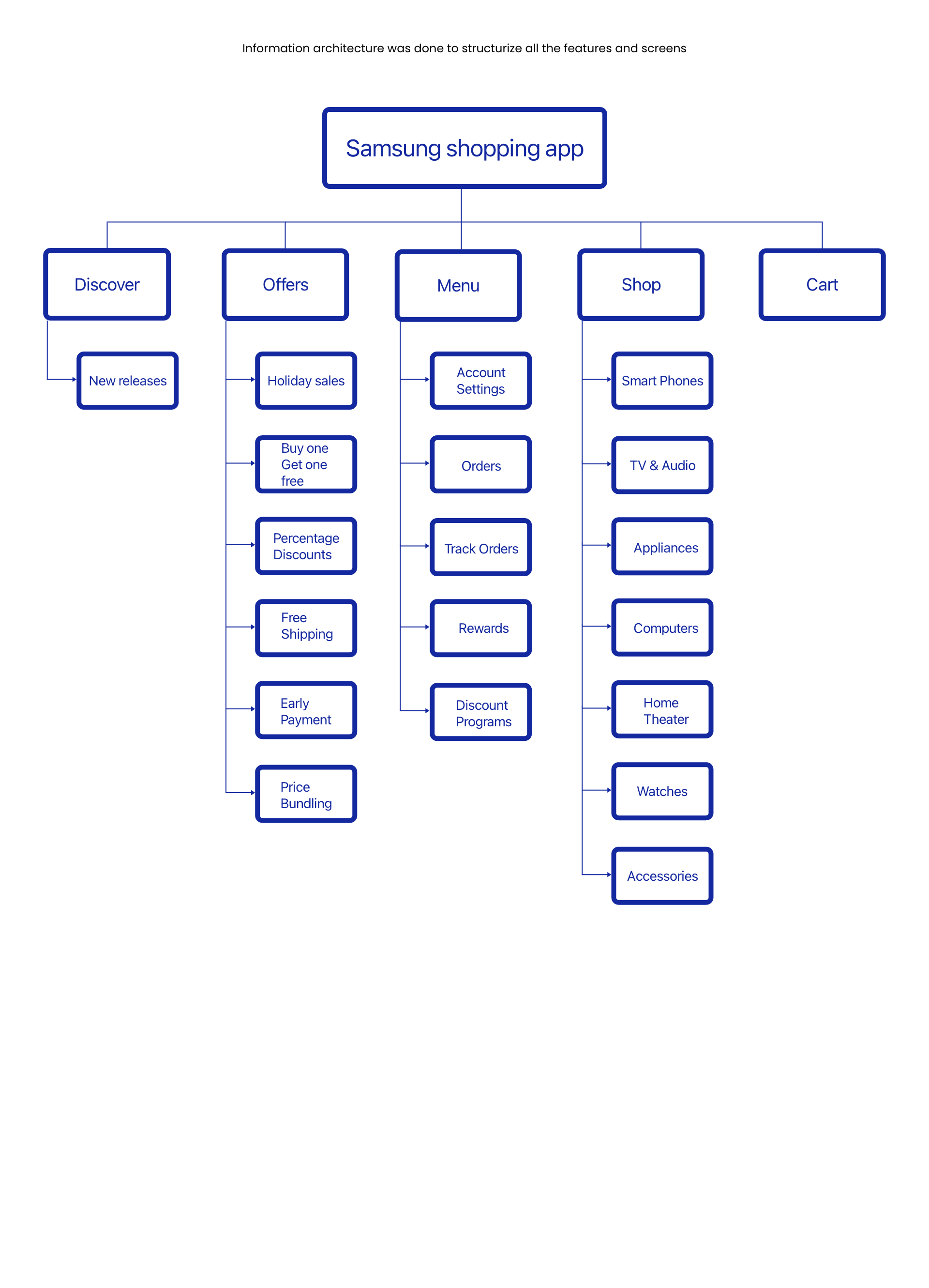
Card Sorting was done to Categories all the features under different sections which will further help in organizing the information architecture

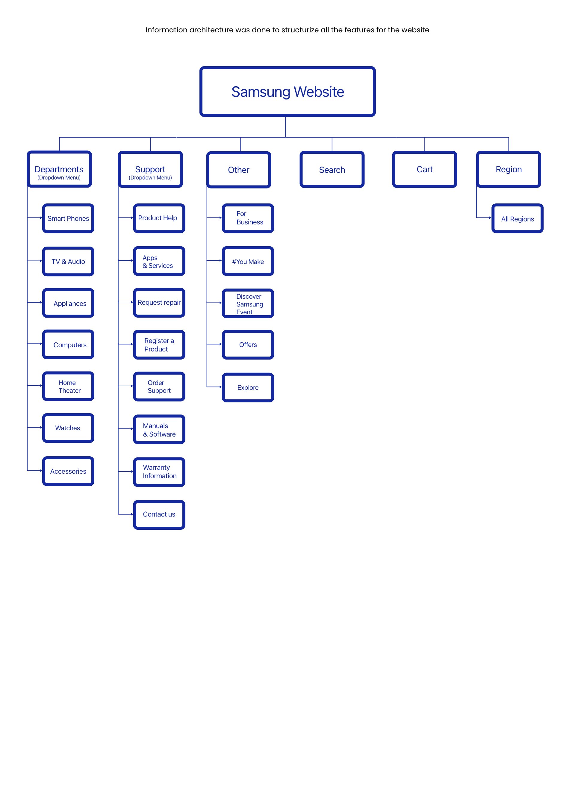
Information Architecture- Web
Information Architecture- Mobile
4. Design
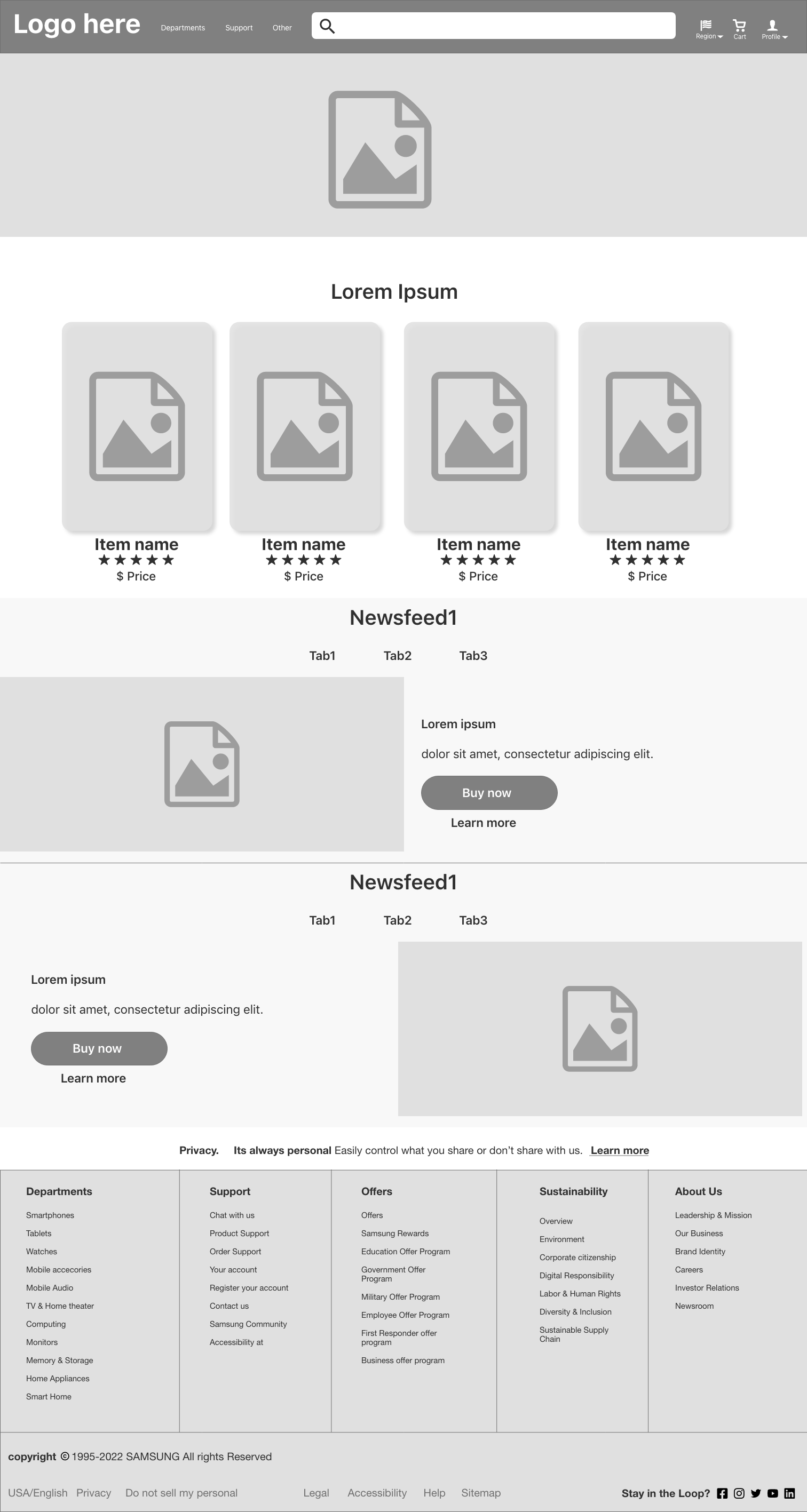
Low Fidelity Wireframes (Web)
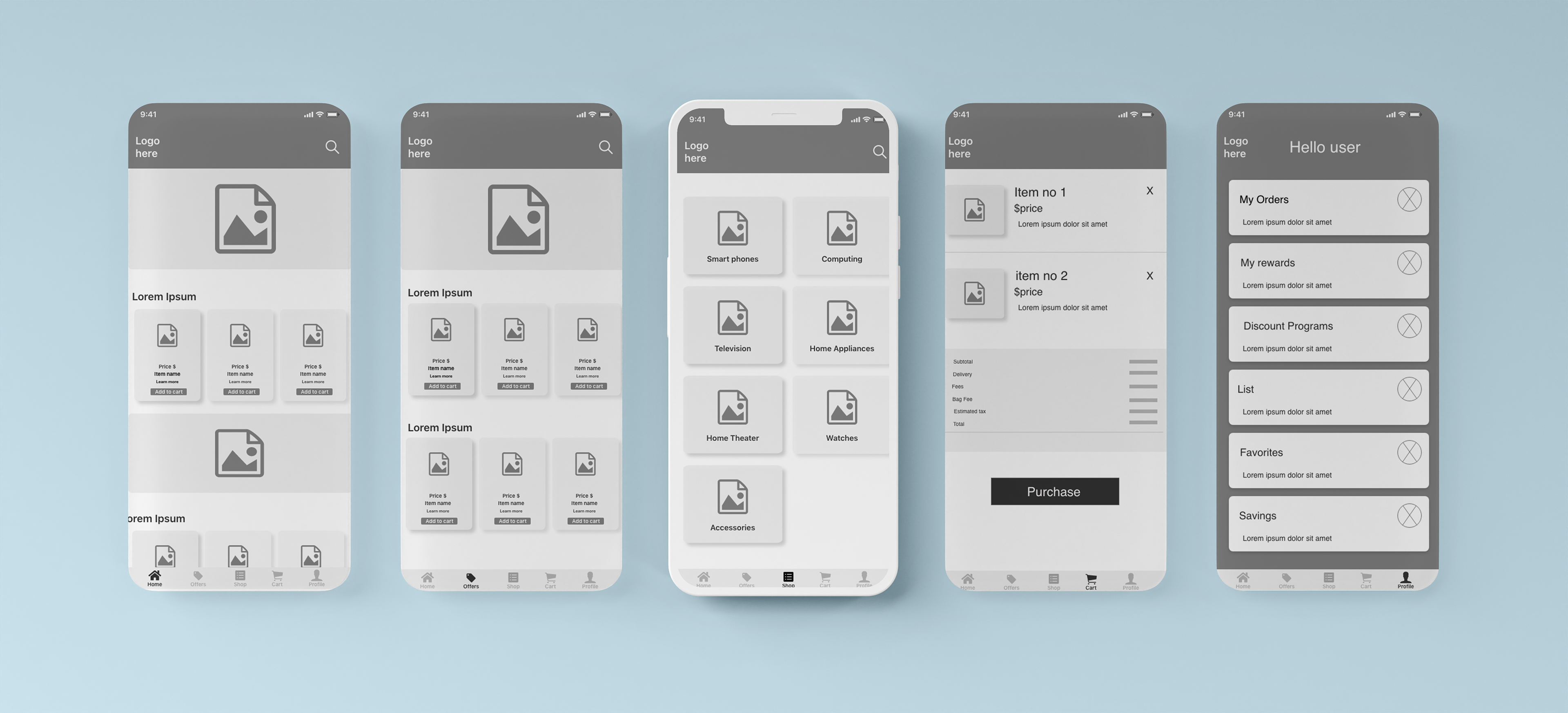
Low Fidelity Wireframes (Mobile)
High-Fidelity Mock-ups

Website

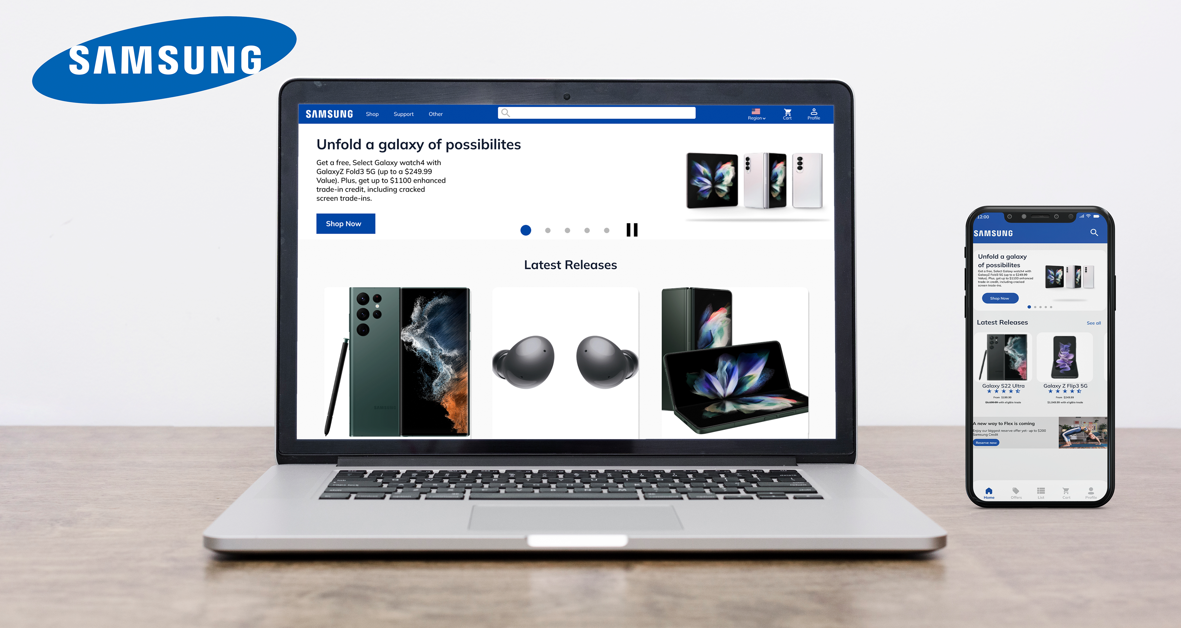
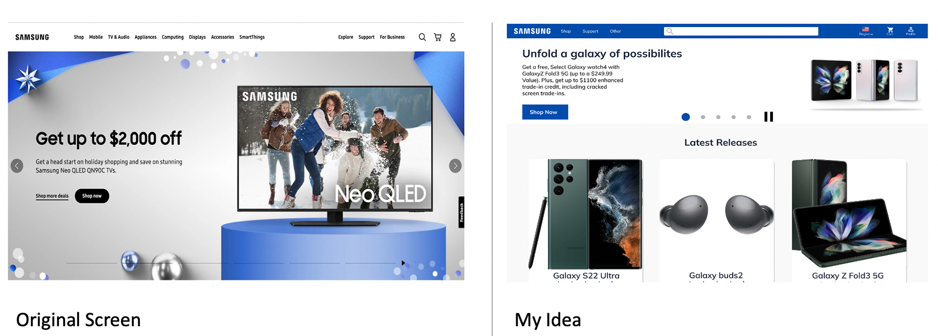
Website Comparison between Original Vs My Idea
Home Screen
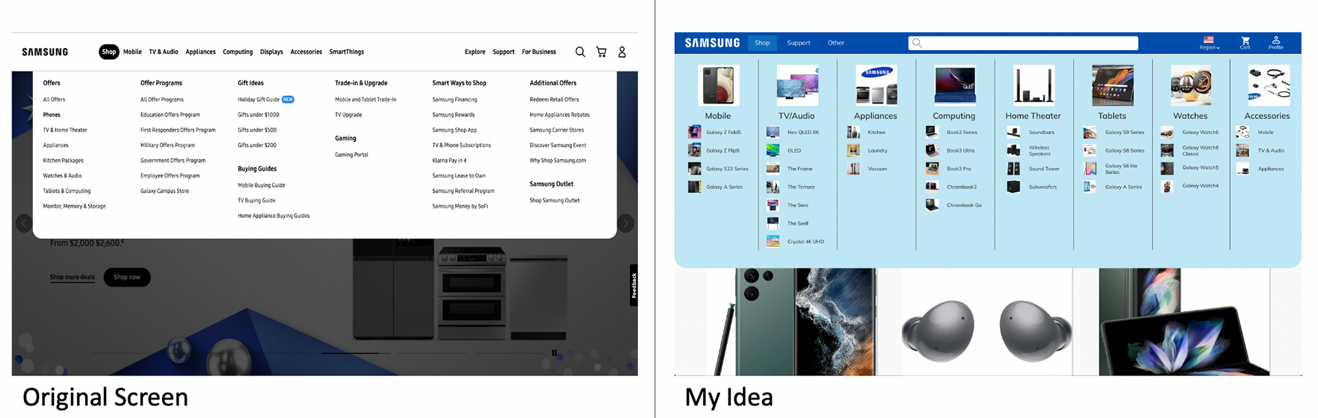
Dropdown Menu
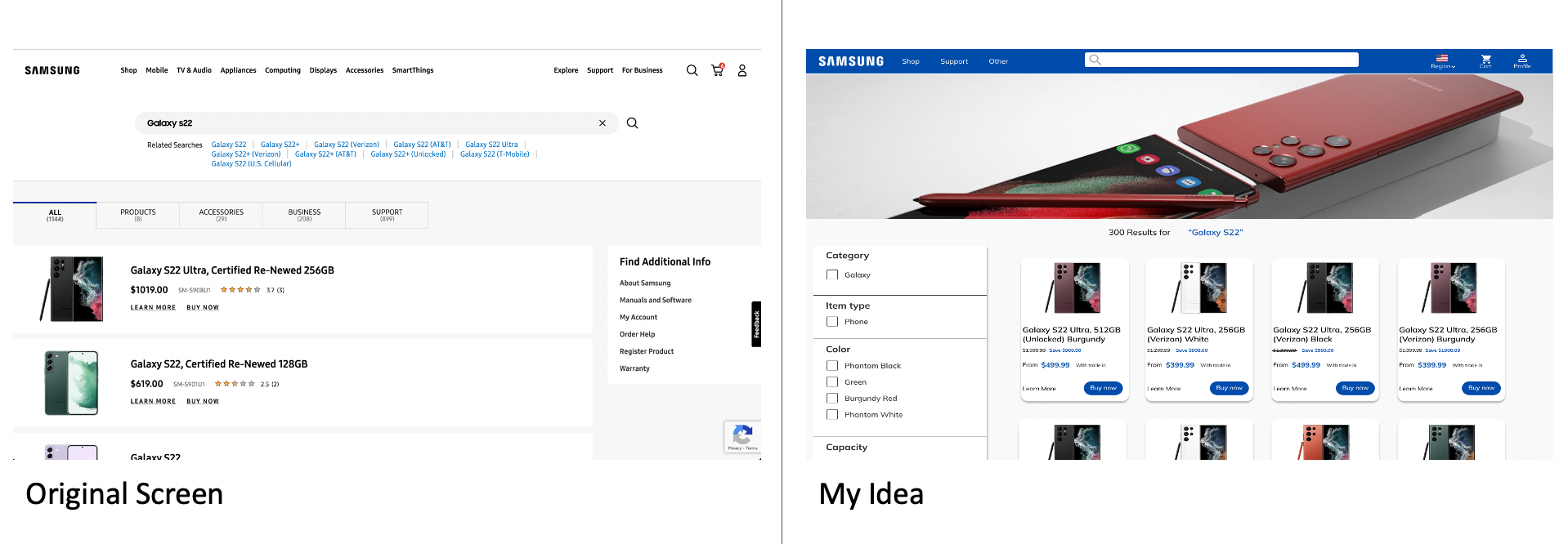
Product Search (Galaxy S22)
Product View (Galaxy S22)
Overall
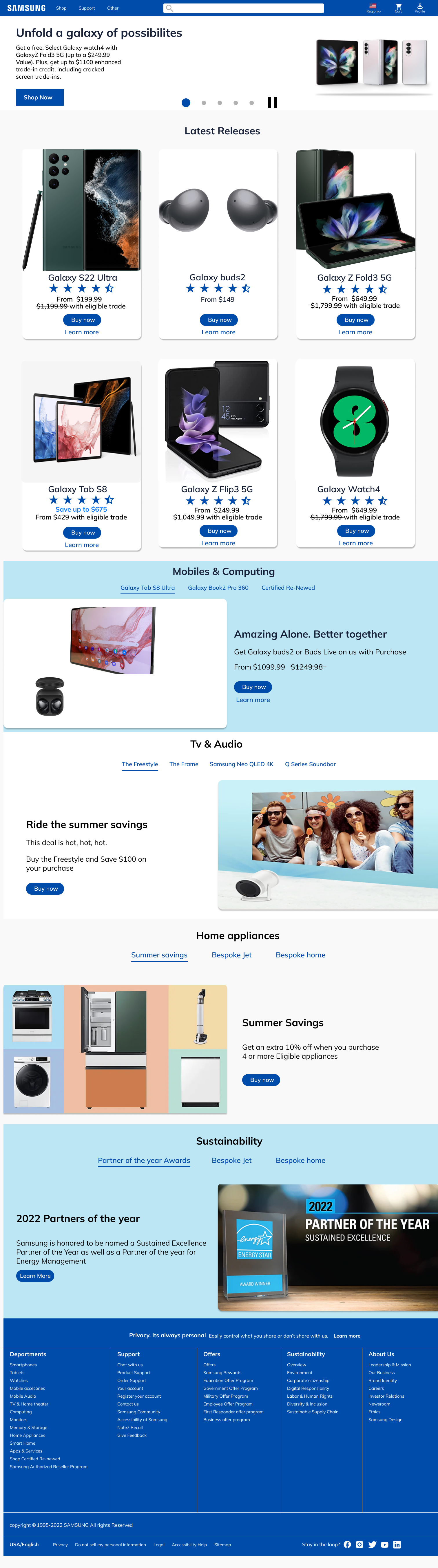
Home Screen
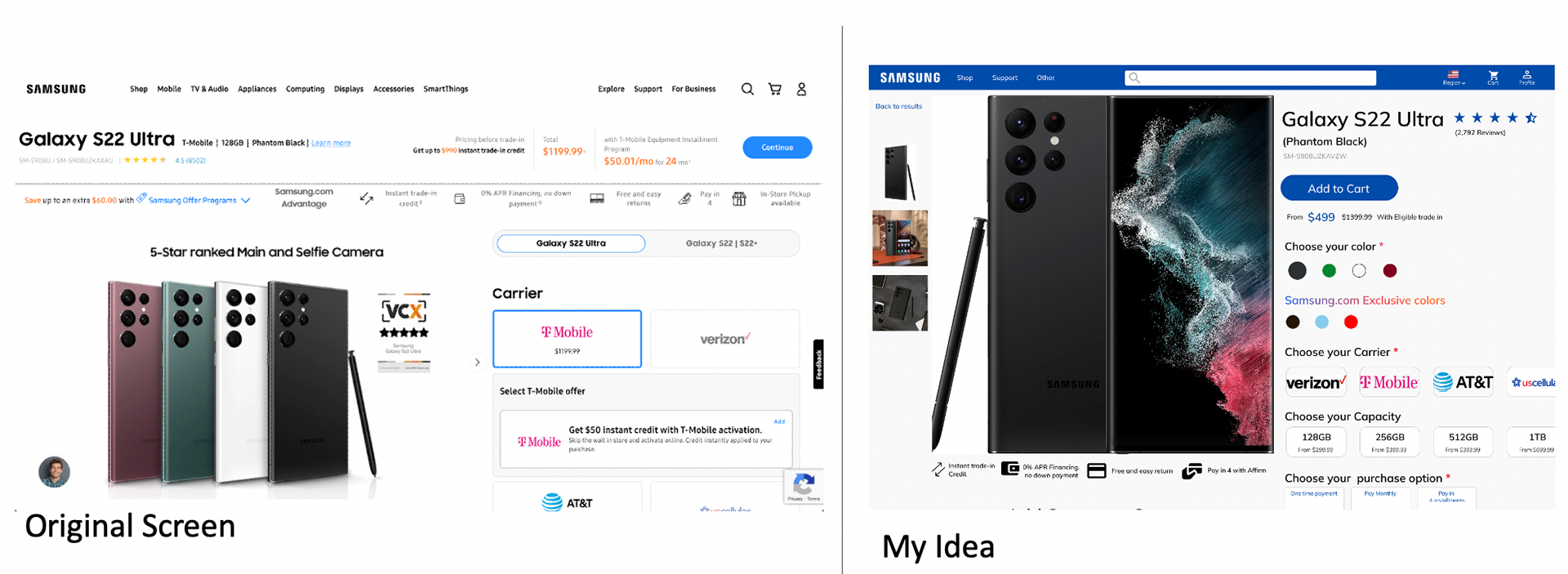
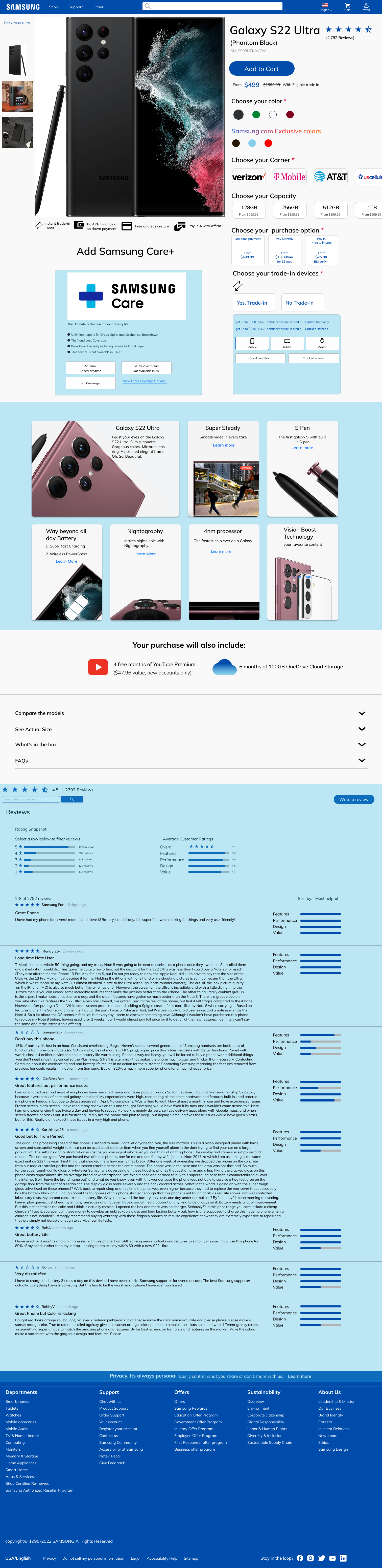
Product View (Galaxy S22 Ultra)
Mobile
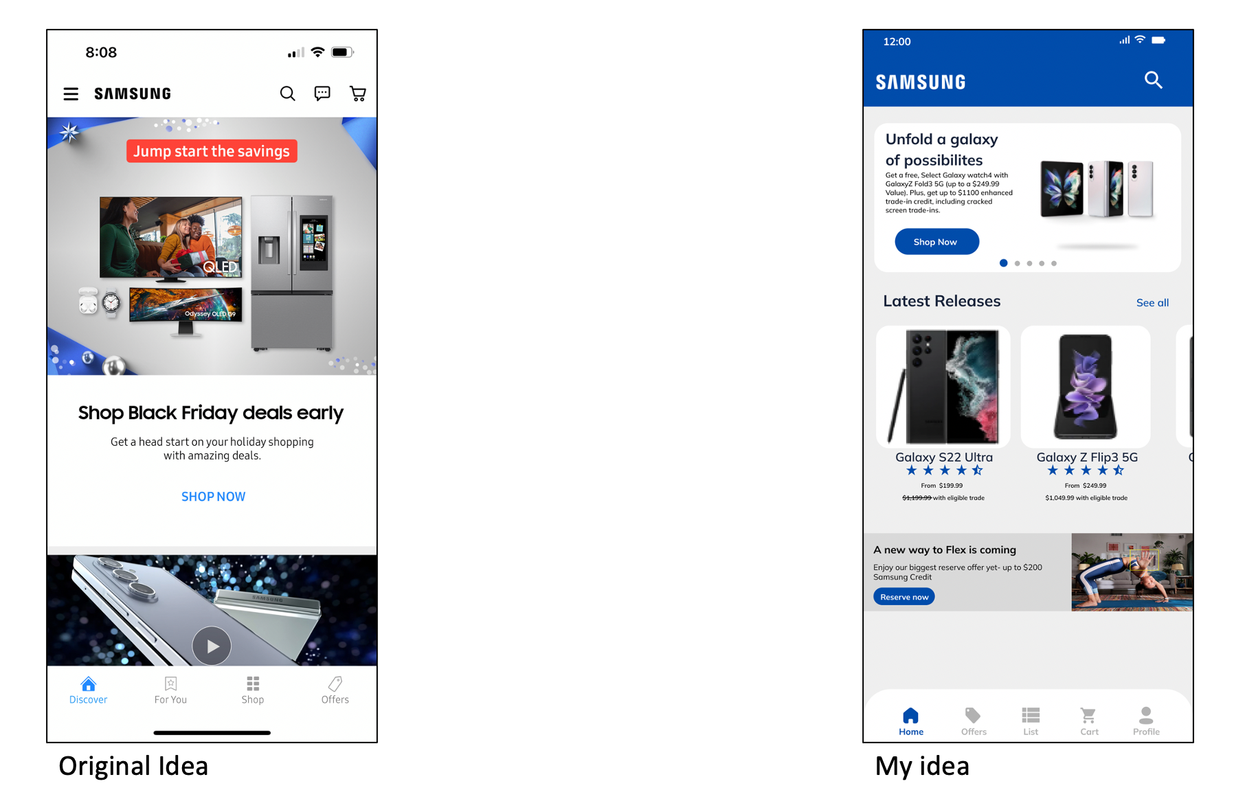
Mobile App Comparison Between Original Idea vs My Idea
Homescreen
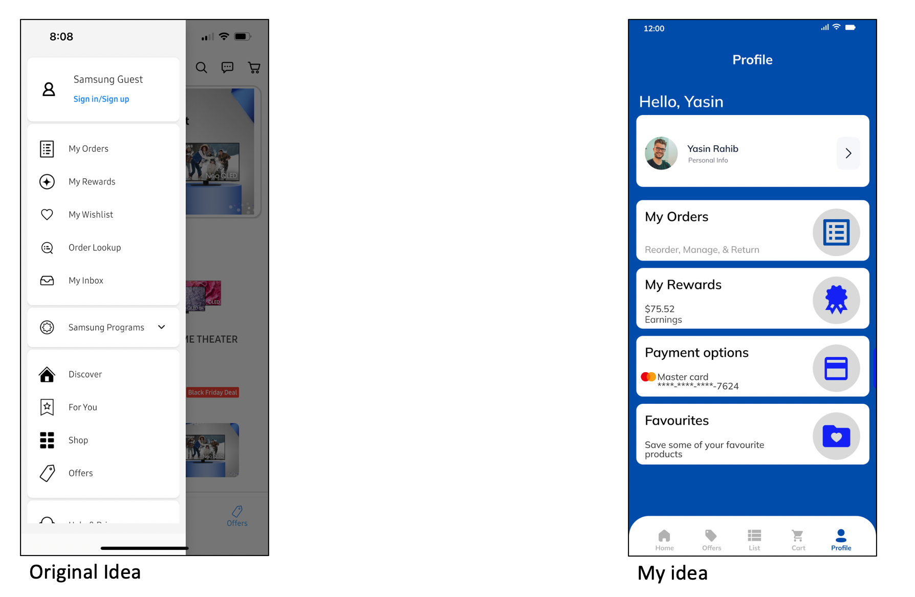
Profile
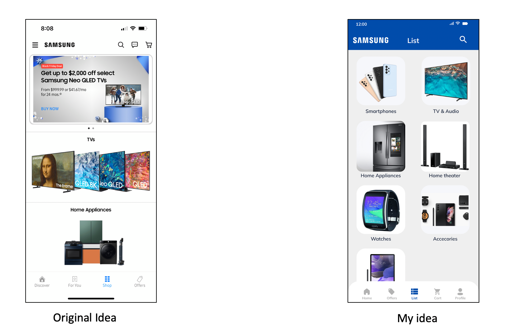
List
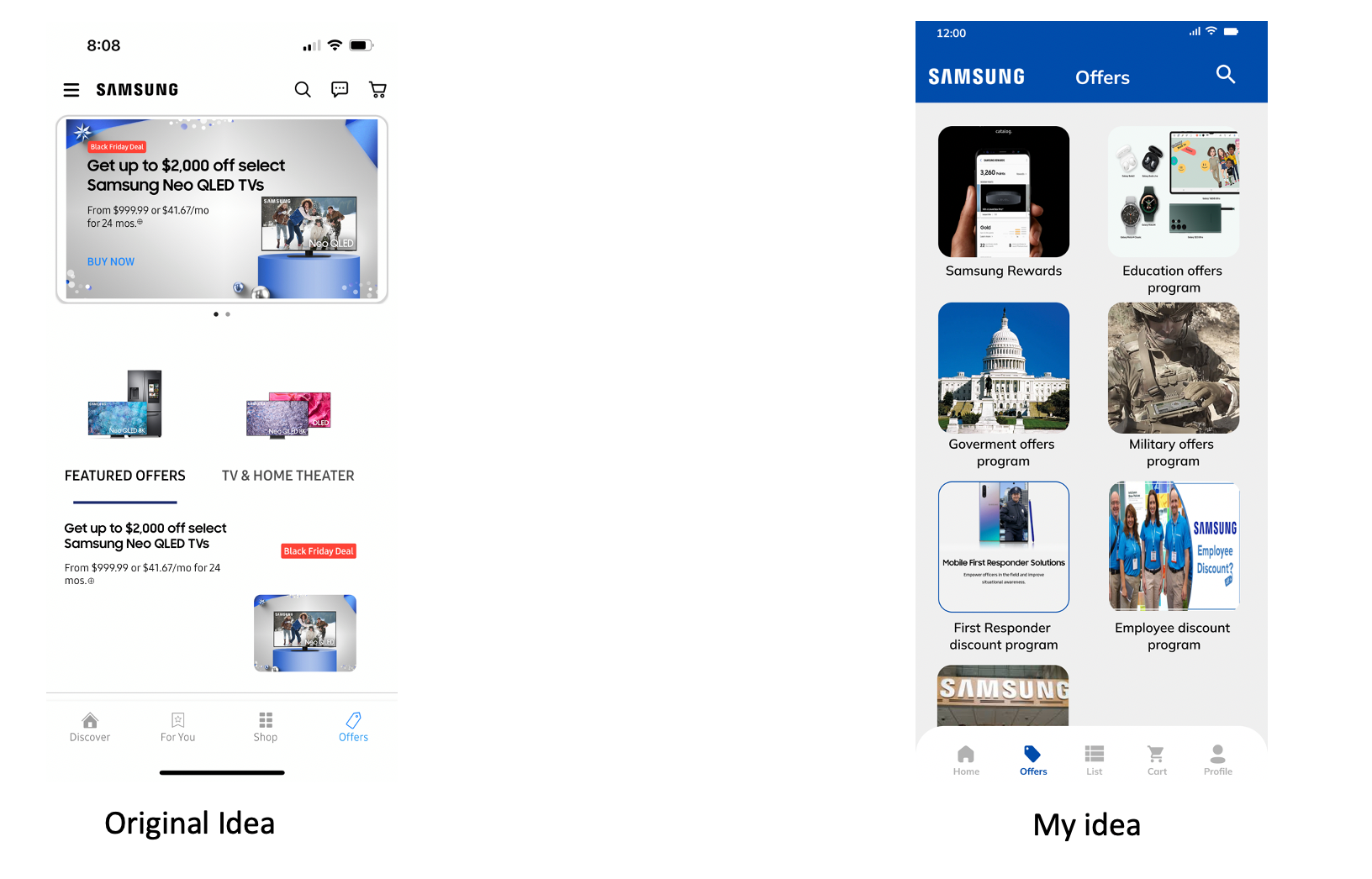
Offers
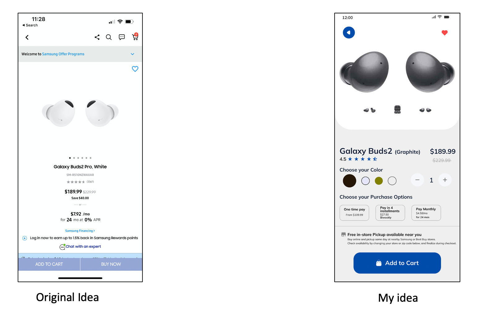
Product View (Galaxy Buds)
Overall
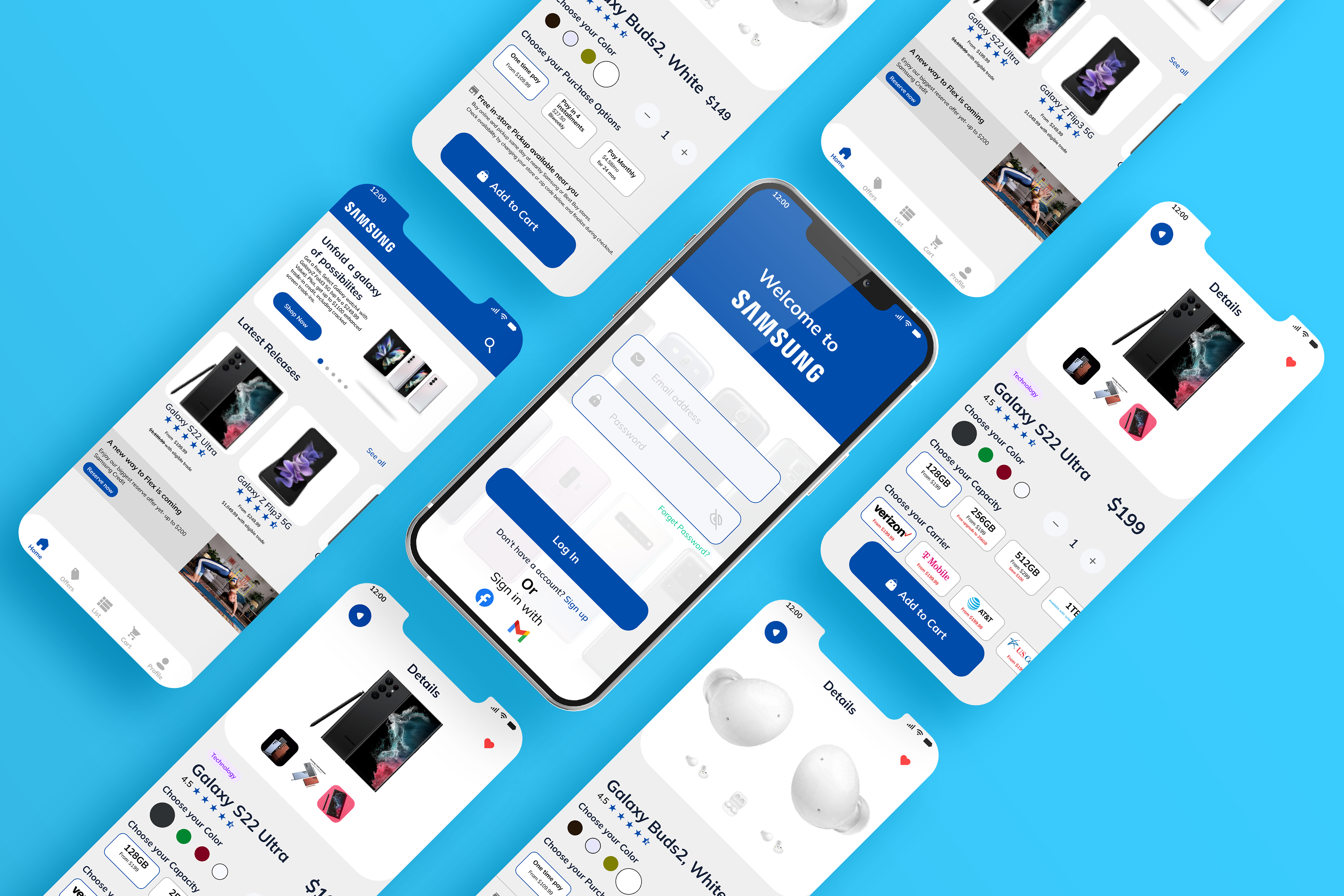
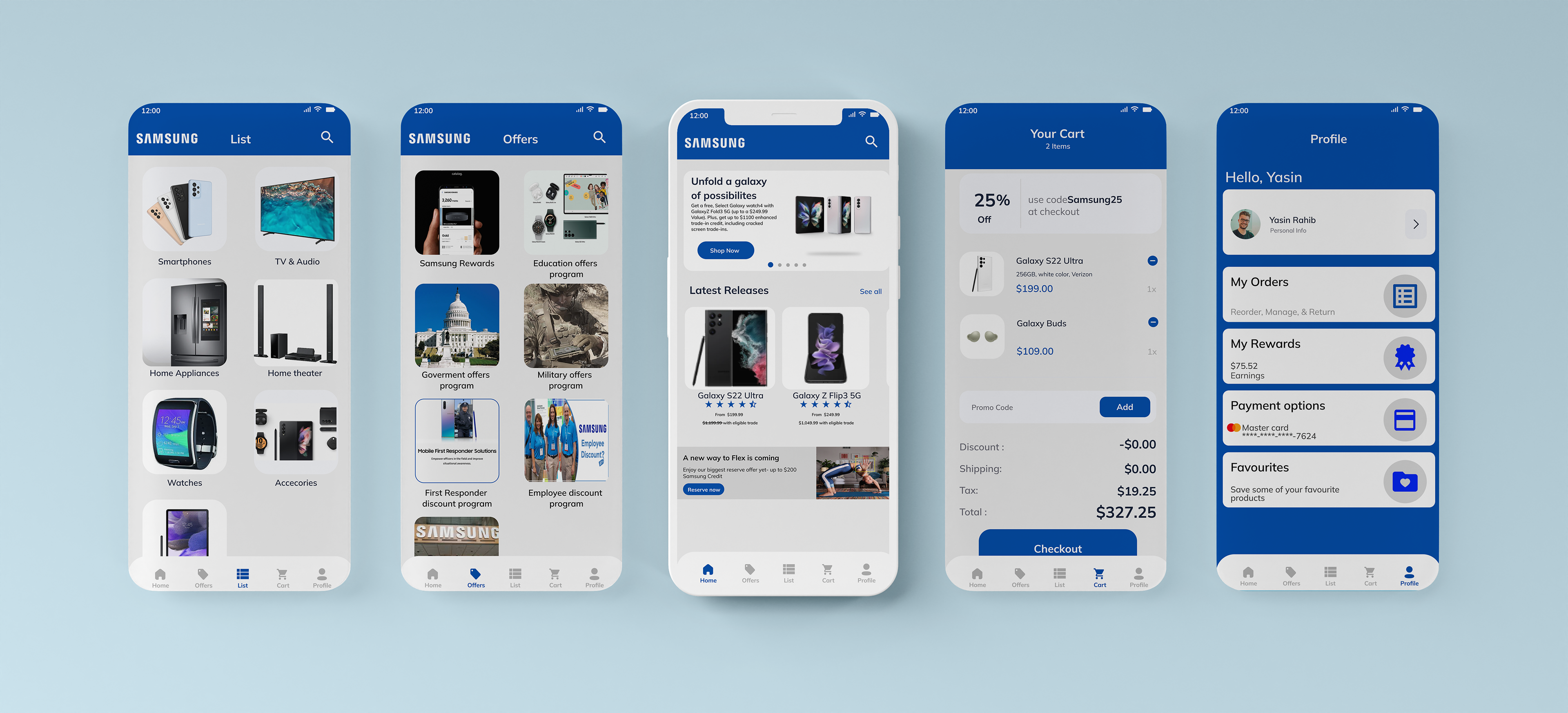
Navigation Screens
Prototypes Mobile
5. Testing
Usability Testing (Web)
Tasks
1. Buy a Samsung Phone
2. Search for products
Participant Count
9
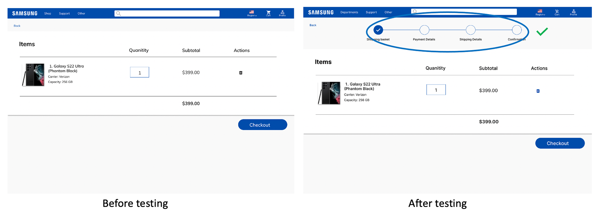
Task 1 Analysis (Buying a Samsung Phone)
1. Majority of the Users didn't know how long the process takes so I decided to add a Progress tracker to let the User know what steps they will take when processing orders
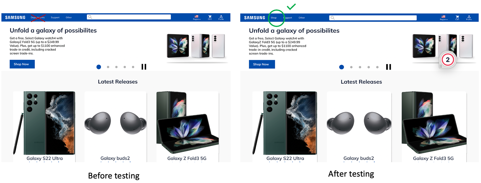
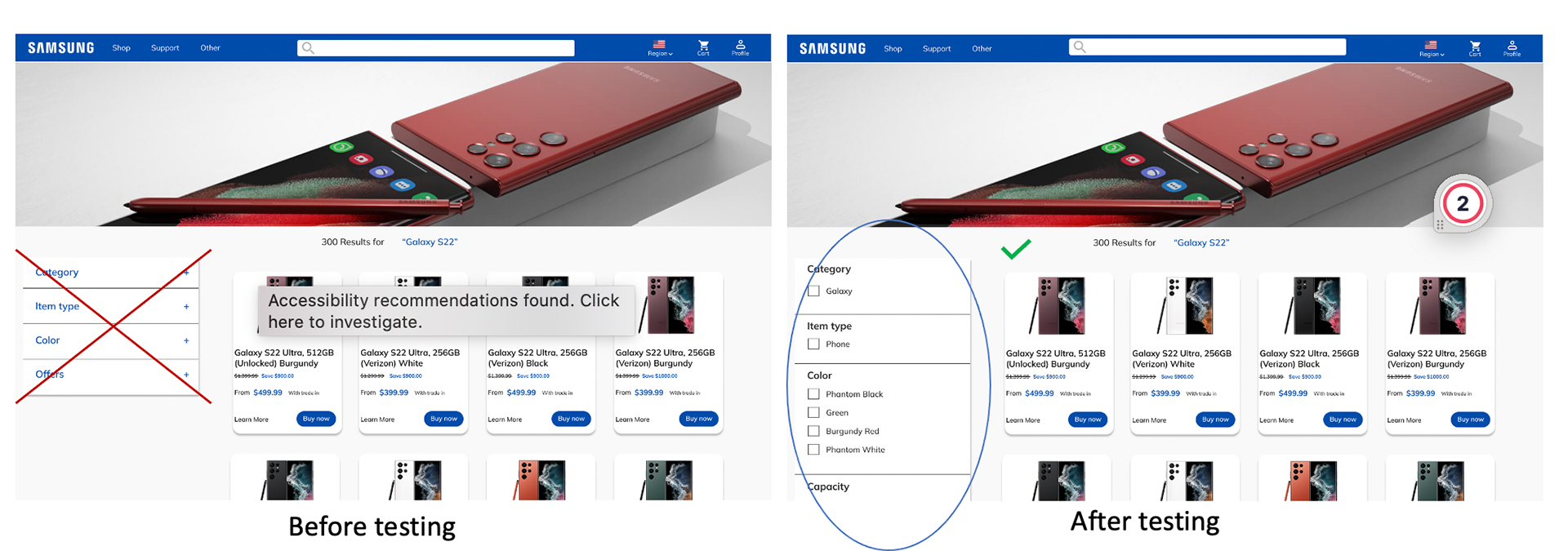
Task 2 Analysis (Searching for a product)
1. Some of the users were confused about the dropdown option, most importantly with the 'Departments' option, which is why I decided to change it from 'Departments' to 'Shop'
2. Majority of the feedback relied on the filter option being closed as opening and closing it was a hassle for them so I decided to leave the filter option Open
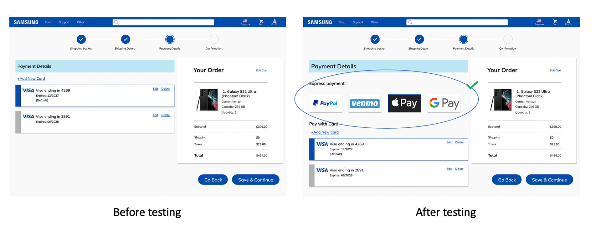
2. For Payment Options a lot of the Users had preferred payment methods rather than just their Card information
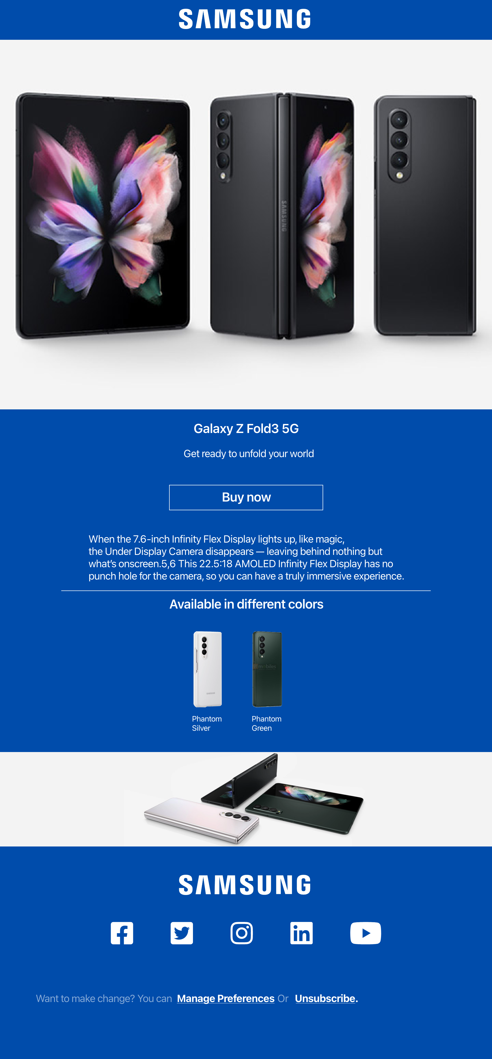
Promotional Email
Conclusion
I enjoyed this project so much as I grew up around Samsung Products and my Father was a Vice President of Samsung Sales and Marketing. I hope that one day I can make a difference in Samsung by providing them with a User-friendly and easy-to-use platform where Samsung fans can start interacting with the Samsung website and Mobile App.